Saturday

Studio

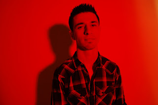
I took bish into the studio to do some better quality images than the one I had been taking of him in his bedroom. I also wanted better lighting and to be able to use the white backdrop, that bish would be able to cast a shadow onto to create similar 3D images that James Dequeker does. The images of his of the models infront of white backdrops with strong shadows cast onto the backgrounds, seem to work the best in 3D and I wanted to try it out for myself

Left eye
Right eye

Both images together to create 3D.
Same image as above, except the 2 images are further apart, so you can see more of the red and blue.
Turned the image into a negative.


This is the image I wanted to create, with the shadow in the bakground to give the image that extra depth. Works well as a 3D image. The one above is the same image only the 2 images are farer apart.


Mixture of creating a 3D image with the Helmo images. Made left eye image red and below, right eye image cyan.

Right eye, cyan.
Both images put together. However when the colours are mixed togethern they aren't strong enough to match the red and cyan lenses on the glases, so the image doesnt really work very well 3D.

Used a red filter over the studio light. I have never used the filters before and i wondered if i could get the red and cyan images without having to do it in post editing. However I didnt really like it with the filter, I felt that it lost alot of detail within the image.


Monday

Helmo Testing

I really liked the images from Helmo, of the models mixed with the animals and decided to have a go at creating a few myself. The idea is that when you look at the image through 3D glasses that the two seperate images that are overlapped combine and fuse together. When you close one eye, to leave the eye looking through the red lense, then the image that is red dissapears to reveal only the blue image. When you swap over and are only looking through the blue lense, the bluse image dissapears, leaving you with only the red image. To create the images I got her face and through slelective colour made her all red. I cut her head out of the original image and placed it onto a black background. I then did the same with the image of her paw, however made it blue/cyan. Then I put one image ontop of the other and made the transparency of the top image more so that the bottom image would appear. To make sure the image worked, I put the 3D glasses on while editing, making the colours more or less.

Test of my dog Fizz.The red image is of Fizz's face and the blue image is of her paw. The image works really well looking through 3D glasses, however not as good as the Helmo images. I have no idea how they created theirs, I merely assumed what they may have done to create my own, which havent worked out as well.

This image works less well probably because the red hair isnt outlined within the image but spreads over all of the canvas.  

Friday

jbgvfgc

An image I found on deviantart that I thought would work well through 3D glasses because of the 2 colours red and cyan. 

Edmund Clarke (No Place To Go)

The project titled No Place To Go by photographer Edmund Clarke, looks at asylum seekers living in britain. It shows several portraits of the asylum seekers, mainly in their place of stay,   covering their own faces. The idea of this is to convey their loss of identity, showing them as just a figure and also to show the fear they hold towards their circumstance.


I really like the concept of the people within the images covering their faces and their identity. It makes you wonder about who they are and what their situation is, for them to be in this country. I also like them being square portraits, i think it frames the subjects really well. I like the vibrant blocks of colour within some of the portraits, its brings that extra something to the image to make them eye catching.

Sunday

More 3d Testing

March 5th 2011

So after my last lot of 3D images there were a few things I wanted to sort out, such as making my 2 images, left eye and right eye, closer together and more matching, to see if my results were any better. I also wanted to try out 3D images which have more activity in them, such as more object and a bigger depth of field.


I wanted to try out how a 3D image would look with lots of different object within it. This image doesn't really work very well, it is flat as a 3D image.

..........................


More testing with objects. This one works better than the first, I think because it has depth of field in it. A background with something in the foreground.

.................................

2D
Left Eye
 Right Eye

3D
Left Eye
Right Eye

.....................


Left Eye
Right Eye

These 2 images are not as exact to one another as the previous left/right eye images I have taken. This is because I moved the camera while taking them to create the double exposures/movement in them.

3D

Even though the 2 images to make this 3D image are not as exact to one another as they should be to create a 3D image the result works really well and I love how you can see the overlapping of the 2 images. Because they are not close together, when you look at the image with 3D glasses you get double exposure as well as a 3D image, which I really like. I also did a black and white version.

I think I prefer 3D images in black and white. When you look at a 3D image in colour you don't really notice the colour of it, but when you look at a 3D image that is black and white the subject stand out a lot more and so does the 3D effect.

In this one I moved the images closer together, how they usually are in 3D. The image is a lot more defined, as there is not multiple exposures any more. This makes the 3D side to the image a lot stronger..

..........................


I tried experimenting with 3D using an earlier image that I had taken of Bish. Instead of using the 2 different images from the left and right eye, I used 2 of the same image but positioned one further along so that you are able to see one in red and one in blue. The image doesn't really work that great as a 3D image.


3D Testing

February 15th 2011

So I took some photo's of Bish to experiment wityh creating 3D images of my own. I had to take 2 images for each 3D image I wanted to make, one from my left eye and the other for the right, to put together. I was unhappy with how most of the images turned out. I think that I perhaps may of taken the 2 images too far apart.


Before: 2D

After: 3D


I think that this image works particulary well in 3D mainly because of thye shadow that is cast from bish onto the wall behind him. Like the James Dequeaker 3D fashion images, I felt that the ones with shadow in them presented themselves the best in 3D. I think that it gives layers to the image in 2d which are only emphasized in 3D.


This is one of the images that didn't turn out so well in 3D. There is no depth in the image as a 2D photograph and so little comes alive when the image is made into a 3D one. Also I think that I may have moved a little too much inbetween both images and so when they have been put together they are a little  unbalanced.